Landfill Alternatives
From broken and invisible to fast and lead-generating. We transformed Landfill Alternatives' site with smart strategy, SEO and a high-performance rebuild.
Sector
Waste Management
Our Team
- AM
- BH
- RH
Deliverables
- Website
- Payload
- Booking Portal
Jump to Section
.webp&w=3840&q=75)


The Challenge
Challenge
When Landfill Alternatives came to us in 2018, their website was holding them back. Pages loaded slowly, if at all. Search visibility was non-existent. And with a wide range of recycling equipment and bespoke systems on offer, they had no effective way to help users find what they needed. The business was well-established, but their digital presence didn’t reflect it.
They needed a site that showcased their expertise, captured demand, and drove results. Fast.
Approach
First, we focused on clarity, mapping real user needs to structured journeys that made sense. Then we backed it with a no-nonsense SEO strategy, technical cleanup, and content that ranks. Every element was designed to pull its weight, convert better, and scale with the business.

The Details
Phase One: Cleaning Up the Mess
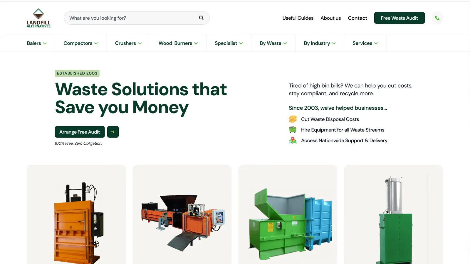
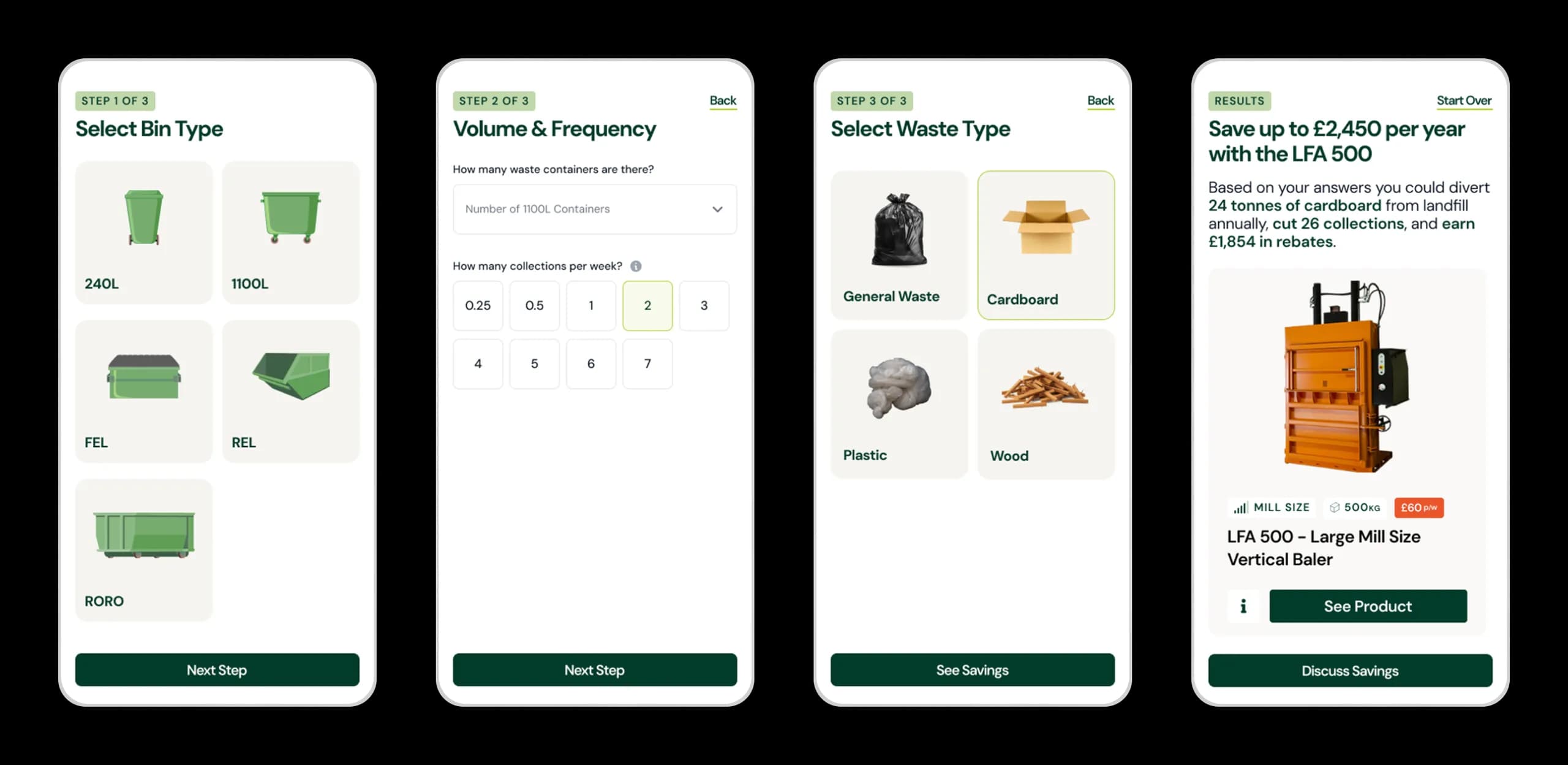
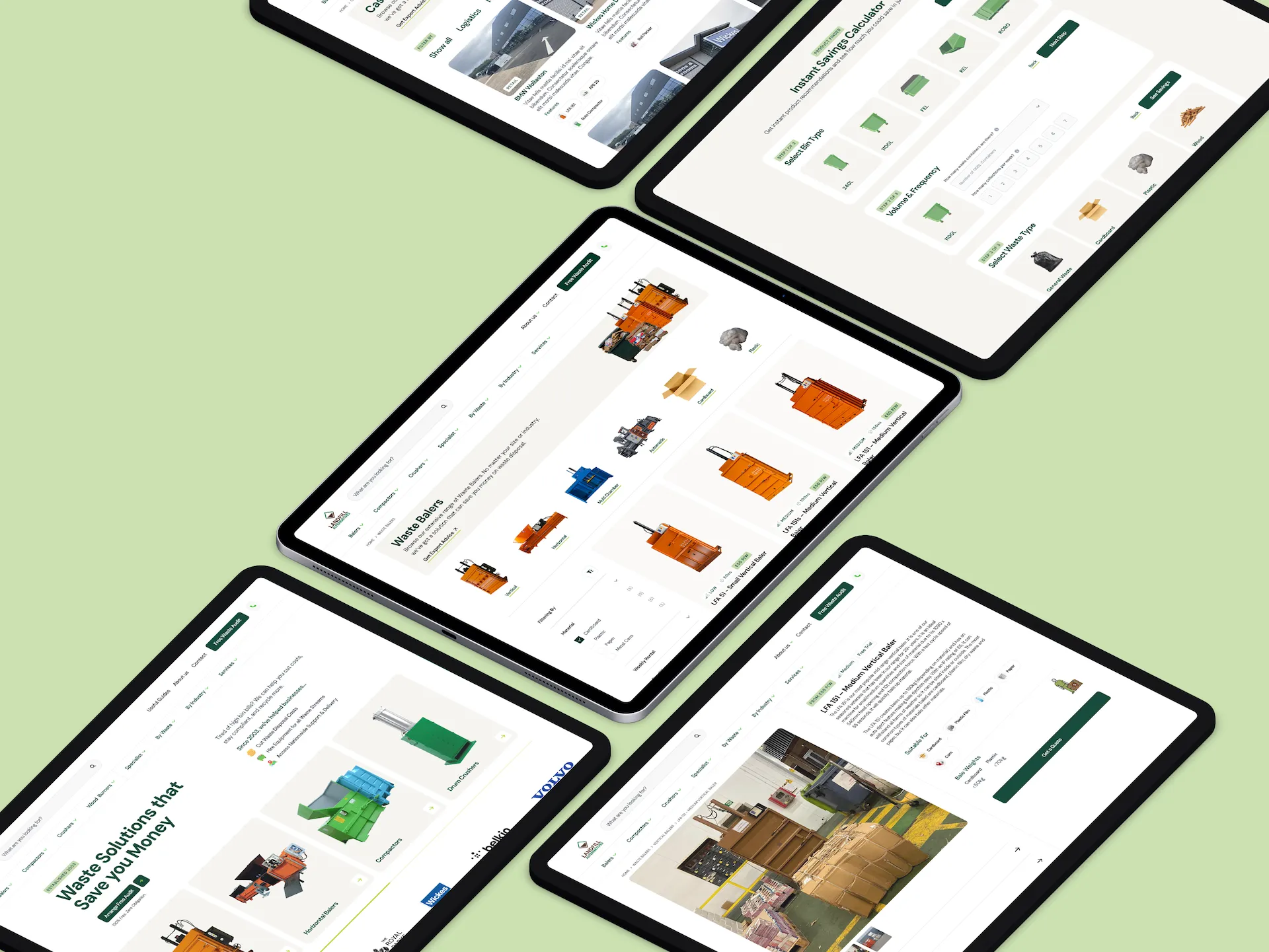
We rebuilt everything from the ground up. Designed user journeys around the three key ways people shop: by material, by industry, or by machine. Whether someone’s trying to get rid of cardboard, works in hospitality, or already knows they need a horizontal baler - we made sure the site could serve them fast. And for those unsure, the product finder tool guided them to the right solution.
Search That Converts
From day one, SEO was a priority. We built a full strategy around core topics and search behaviour. Category pages, technical optimisation, regular content and link building.
The results speak for themselves:
From 100 visitors a month to thousands. And a steady stream of qualified leads.
Search now drives the majority of LFA’s inbound pipeline - and the work continues.
Phase Two: Raising the Bar
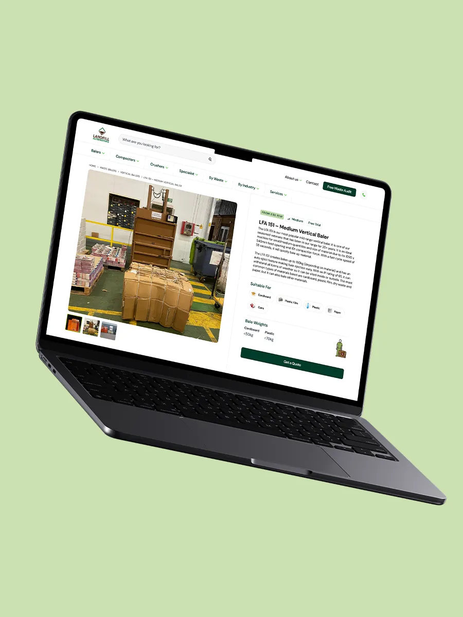
By 2025, it was time for a serious upgrade. The product line had grown. So we migrated the entire site to Payload CMS for lightning speed, scalability, and modern flexibility.
Armed with seven years of insight, we redesigned the entire user experience from the ground up. Sharper navigation, faster load times, and trust-building content throughout.
The Product Finder was rebuilt to be even more powerful - now showing real-time savings based on a user’s waste disposal costs and product selection. It’s become a key sales tool for the business.
Client Feedback
What started as a rebuild turned into a real long-term partnership. They’ve improved every part of our digital presence and helped us bring the business up to speed online. The SEO results alone speak for themselves.
Carrick Director of Sales
Facts & Stats
Increase in Traffic
Increase in Monthly Leads
Increase in Session Duration
Reduction in Bounce Rate
The Outcome
An Ongoing Collaboration
LFA was one of our first clients and one of the sharpest. They saw early that digital could drive real results in a space that’s traditionally behind the curve.
That trust gave us room to deliver. From a broken site with no traffic to a platform built for performance, the transformation has been huge.
And we’re still improving it today.
